Annotated Corpus Map
Annotated Corpus Map visualises, cluster, and annotates documents with keywords in two-dimensional projection.
Inputs
Corpus: A collection of documents to visualise.
Outputs
Selected Document: Documents selected from the plot
Corpus: Data with an additional column showing whether a document is selected and information about the cluster the document belongs to
Scores: Table with scores and p-values for each keyword averaged per cluster
The Annotated Corpus Map widget provides a 2-dimensional scatter plot visualization of the document. The documents are displayed as a collection of points, each having the value of the x-axis attribute determining the position on the horizontal axis and the value of the y-axis attribute determining the position on the vertical axis. Widget clusters documents according to annotation settings and assigns keywords to each cluster. Keywords are extracted with the TF-IDF method.
Axis X and Axis Y let you select attributes you will show in the widget. We suggest using the t-SNE widget before Annotator and selecting
t-SNE-xandt-SNE-yas x and y attributes.Annotation: Select the method to identify clusters:
DBSCAN clustering: Set epsilon, the maximum distance between two samples for one to be considered as in the neighbourhood of the other and those clustered together. Unchecking epsilon will instruct the widget to set epsilon automatically.
Gaussian mixture models: Select the number of desired clusters. Unchecking clusters will instruct the widget to set the numbers of clusters automatically.
From variable clusters documents according to a selected categorical variable.
FDR Threshold sets the threshold for selecting a keyword as a cluster’s keyword. Keywords with corrected p-value (FDR) from the hypergeometric test lower than the threshold are selected.
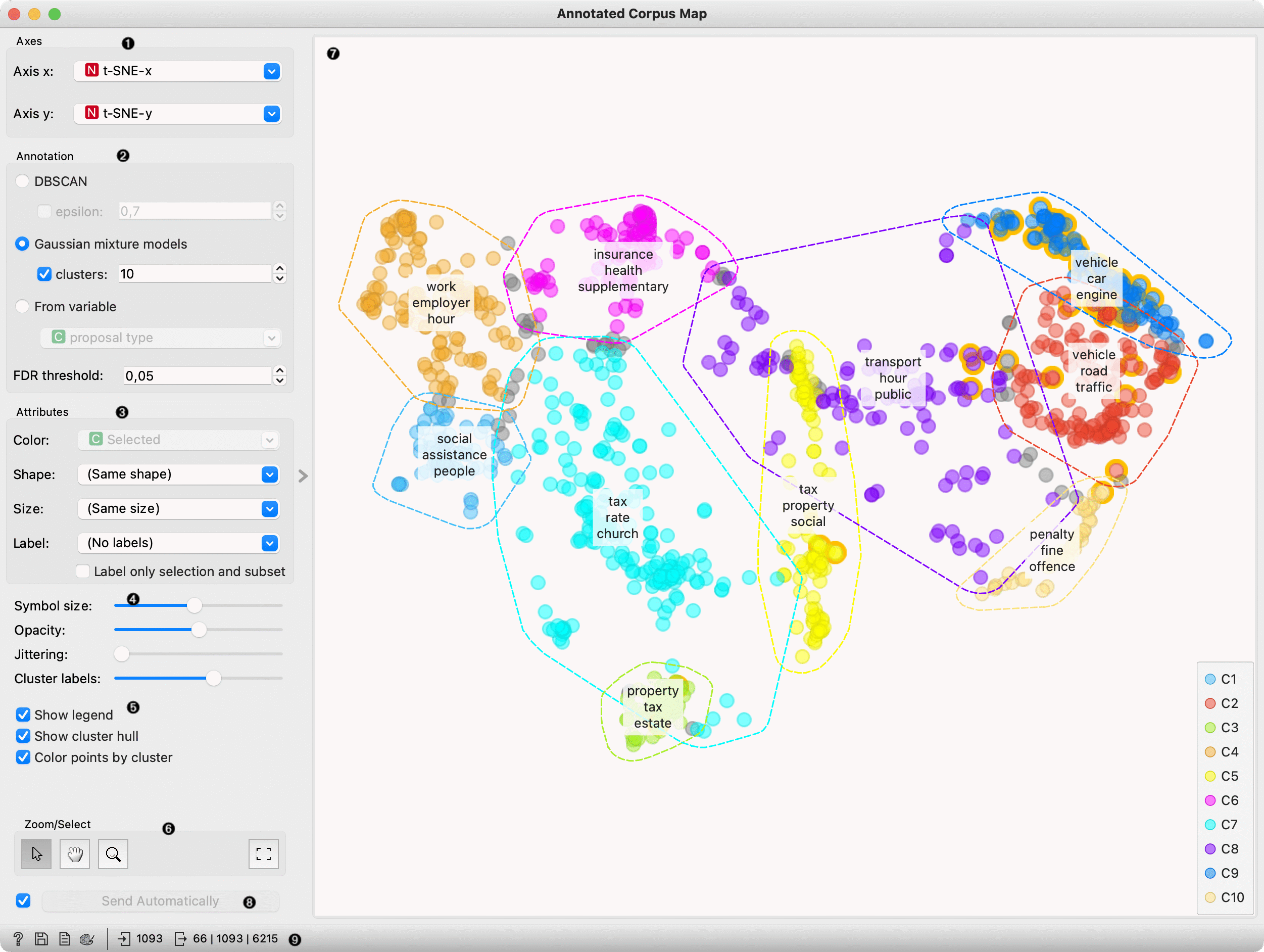
Attributes: Set the colour of the displayed points (you will get colours for categorical values and blue-green-yellow points for numeric). Set label, shape and size to differentiate between points. Label only selected points allows you to select individual data instances and label only those.
Set symbol size and opacity for all data points. Set jittering to prevent the dots from overlapping. Jittering will randomly scatter points only around categorical values. Cluster labels define how many keywords per cluster widget will show.
Set additional plot settings:
Show legend displays a legend. Click and drag the legend to move it.
Show cluster hull displays the concave hull around clusters.
Color points by cluster colours documents (points) with cluster specific color. When this option is checked setting color in box 2 is disabled.
Select, zoom, pan and zoom to fit are the options for exploring the graph. The manual selection of data instances works as an angular/square selection tool. Double-click to move the projection. Scroll in or out for zoom.
Plot with each point presenting documents. Documents are clustered according to the settings above, and clusters are marked with a hull. Over each cluster, the widget places the list of the most significant keywords. Hovering over the cluster labels displays a tooltip with scores and up to ten characteristic words.
Changes are communicated automatically if Send automatically is ticked. Alternatively, press Send.
Get help, save the plot, add the plot to the report, set visual settings and get input and output information.
Example
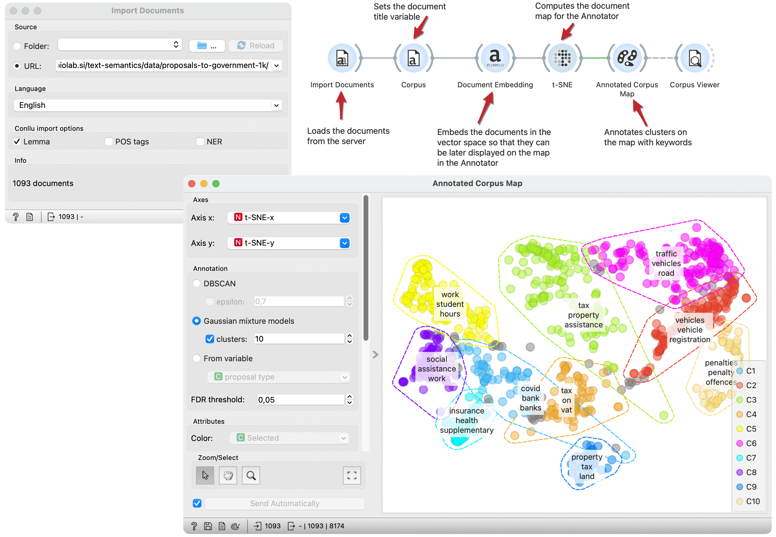
Document maps can be enhanced with keyword annotations. This workflow embeds documents in vector space, computes and annotates a t-SNE document map. The Annotator widget identifies clusters on the map and annotates them with keywords representing a cluster.
We load the Proposal to government dataset from documents repository with theImport Documents widget. In the Corpus widget, we set variables used as text features and the title variable for display purposes.
The Document Embedding widget embeds documents in the vector space for the t-SNE widget to project them in two-dimensional space.
Annotated Corpus Map plots documents on the two-dimensional space. We select t-SNE projection as the x and y variables and decide to use Gaussian mixture models for cluster identification. The widget marks clusters with hulls and places keywords on each cluster.
We got clusters with different topics. In the left purple cluster, we have documents connected to traffic, while the red cluster seems similar but more focused on vehicles and registration. The yellow cluster includes documents related to work and students.
We can select a subset of documents of interest and observe them in the Corpus Viewer widget connected to the output.